9.30.2014

Bungalow Bathroom Update

This bungalow had its original bathroom, with an awkward and tight layout.  All original finishes and plumbing were still in place.  The main goal towards redesigning this bathroom was to allow for a more open layout, brighten up the space and provide a generously sized walk-in, curbless shower.  In addition, the ceiling was popped up to 9'-0", which made the space also feel larger.


Before

By removing the stand alone tub and moving the shower to the window side of the bathroom, it allowed to open up the floor space around the vanity and provide a large, walk-in shower, which was one of the primary design goals.


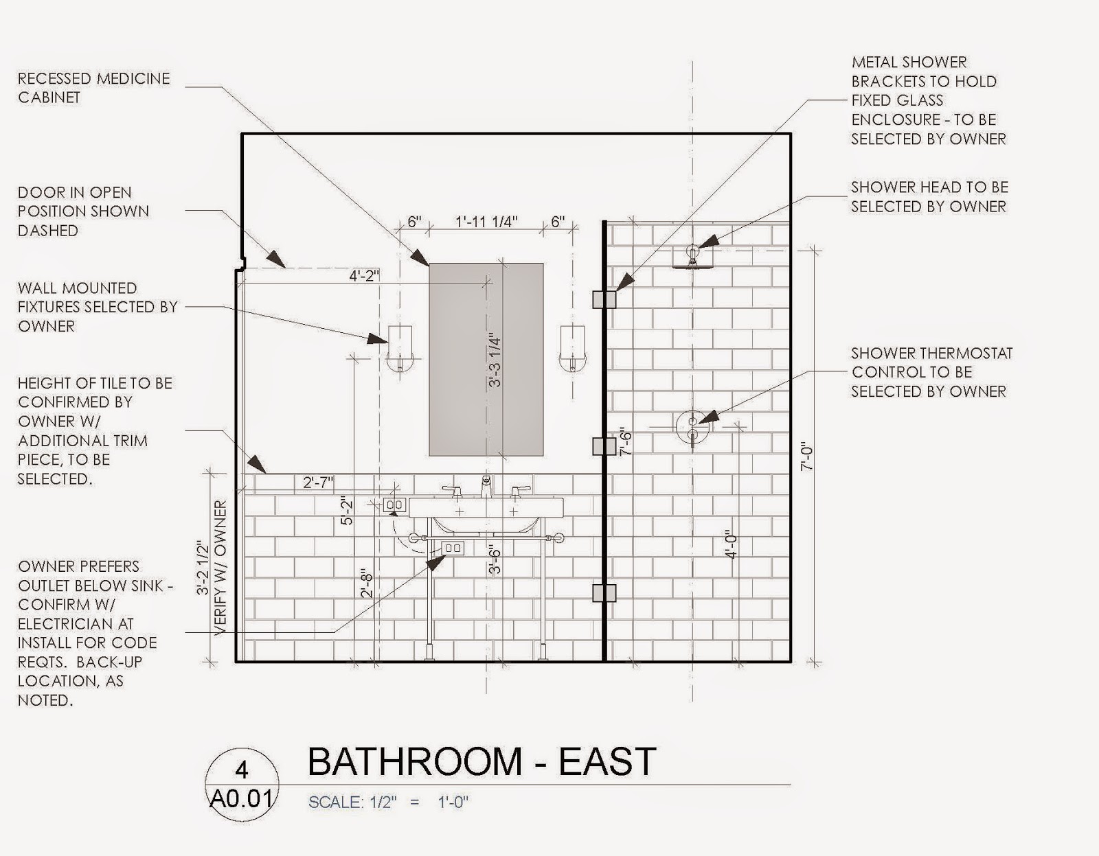
Tile flooring was used throughout the bathroom and directly into the shower, which gave the floor space an even more open feeling.  A clear glass panel separates the open the shower from the rest of the bathroom so that the natural light from the window provides the rest of the space with light.


Photography by Muffy Kibbey


9.22.2014

Bungalow kitchen revamp


This 1940s house was originally built with a more formal floor plan and had a separate kitchen and dining space.  Today, entertaining is less formal and having an open kitchen to your dining room allows for more interaction between cooking and guests and family while still prepping dinner.

Originally, while standing in the kitchen, you would be completely closed off from the dining room and living space.  The desire was to open up this space by demolishing the walls that divided these spaces, while at the same time filling in the existing opening to the kitchen off the main hall, in order to provide a separation between the more public and private spaces.


The new layout provides an open kitchen and dining space adjacent to the living room. After exploring multiple layouts, this galley kitchen optimized space and having a counter for shallow seating provided more counter space and storage below.


Photography by Muffy Kibbey

6.16.2014

Big Boy Room with (subtle) Striped Sophistication

It is imaginable to provide children's space that accommodates their needs without sacrificing the aesthetic and not obsessing on age-specific decor.  A children's room should feel fun, but with a dash of maturity, while also being comfortable and a room to grow up in.


In order to strike this balance, there are certain selections which contribute to the success of this formula.  First and foremost, materials and furniture selections should be resilient to kids' wear and tear which is what drove the selection of the bed, side table, rug and dresser.  The bed is from Room and Board and can be easily transitioned into a bunk bed or additional storage below, which is another trick in selecting items that can grow from toddler to big boy.  The rug is from Restoration Hardware and I recommend selecting the thicker rug pad to add some coziness to a room with a hardwood floor.  The side table is from CB2 and it was important to make sure it had an open shelf that serves as a bookshelf, as well.  The coveted teepee was designed by Theteepeeguy on Etsy.  

Also, rather than just selecting a single color for the wall paint, creating a subtle texture by alternating between a high gloss and matte paint of the same color.  The 8" horizontal banding surrounds the room, but doesn't overwhelm the space while still providing a simple backdrop. 


The side table lamp is from Blue Dot, which has an unique red chord that gives this modern lamp a playful side, too.  Bedding is from Restoration Hardware and the pillows came from Jonathan Adler, Serena and Lily, West Elm and a beloved pattern from Maharam.

The You are my Sunshine piece was done by the talented KA-Art.  She worked with me to customize the size, the lettering, frame and finish.  I can't wait to commission her to do another piece!  The dresser is from Room and Board and the color and material can be customized to whatever you want, which gives another opportunity to showcase something that is 'off the shelf', but doesn't feel it.  

This Land of Nod pouf is the perfect additional seating for reading a book or climbing up and down from bed and easily moveable.

I believe children's rooms can balance between play and sophistication by making careful selections that evolve as your child does, getting more for your money by lasting longer.


Photography by Muffy Kibbey


2.25.2014

From sock to FLOR

Inspiration for home design can come from the oddest places.  Unlikely revelations can appear anywhere.  Don't be afraid to embrace them.

Paul Smith is the master of stripes.  His patterns are part of our daily lives as pillow covers, ottomans and socks.  My husband's favorite pair of Paul Smith socks served as the inspiration for our hallway rug.


At 40 feet long, we needed a rug that would put up with the foot traffic, tricycles and trails of crumbs.  It is the main thoroughfare between our living/dining/kitchen to the rest of our home. It needed to be tough but also fit within our hallway. We wanted to avoid pairing together separate runners that wouldn't stay put. We were stumped.

FLOR is known to be a resilient and easy to maintain flooring option. With children at home, this was critical.  But we didn't want to sacrifice the aesthetic of our home accommodate children.  FLOR would be sturdy, but also provided an abundance of color and texture options, which was useful when matching the colors of the sock.  

As we unpacked the multiple of boxes from FLOR, we were leery about the ease of install, but it did prove to be straight-forward with minimal 'marital disagreement.'

The FLOR dimensions are 20"x20" square carpet tiles.  However, the beauty of FLOR is that you are able to specify if you want your squares cut in half, quarters, diagonally or in half-circles, which allows relatively customizable sizing to the space it's filling.  The spacing of the sock's stripes dictated the FLOR patterning and with such a long hallway it was critical to add some space delineation and not have monotonous rug fill the space.  


Don't be afraid to take inspiration from something that exudes design integrity, even if it comes from an unanticipated place.